# Semantics
# Forms
When creating a form, you can use the following elements: <form>, <label>, <input>, <textarea>, and <button>
Labels are typically placed on top or to the left of the form fields:
<form action="/dataCollectionLocation" method="post" autocomplete="on">
  <div v-for="item in formItems" :key="item.id" class="form-item">
    <label :for="item.id">{{ item.label }}: </label>
    <input
      :type="item.type"
      :id="item.id"
      :name="item.id"
      v-model="item.value"
    />
  </div>
  <button type="submit">Submit</button>
</form>
2
3
4
5
6
7
8
9
10
11
12
See the Pen Simple Form by Vue (@Vue) on CodePen.
Notice how you can include autocomplete='on' on the form element and it will apply to all inputs in your form. You can also set different values for autocomplete attribute (opens new window) for each input.
# Labels
Provide labels to describe the purpose of all form control; linking for and id:
<label for="name">Name</label>
<input type="text" name="name" id="name" v-model="name" />
2
See the Pen Form Label by Vue (@Vue) on CodePen.
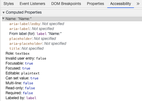
If you inspect this element in your chrome developer tools and open the Accessibility tab inside the Elements tab, you will see how the input gets its name from the label:

Warning:
Though you might have seen labels wrapping the input fields like this:
<label>
  Name:
  <input type="text" name="name" id="name" v-model="name" />
</label>
2
3
4
Explicitly setting the labels with a matching id is better supported by assistive technology.
# aria-label
You can also give the input an accessible name with aria-label (opens new window).
<label for="name">Name</label>
<input
  type="text"
  name="name"
  id="name"
  v-model="name"
  :aria-label="nameLabel"
/>
2
3
4
5
6
7
8
See the Pen Form ARIA label by Vue (@Vue) on CodePen.
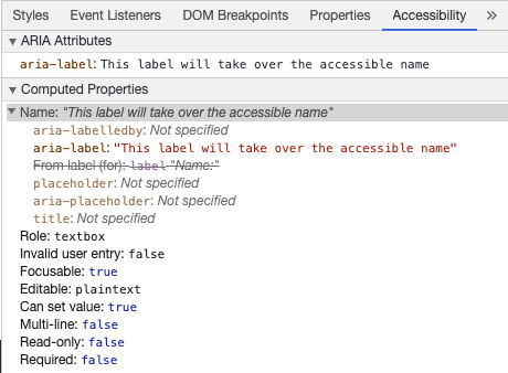
Feel free to inspect this element in Chrome DevTools to see how the accessible name has changed:

# aria-labelledby
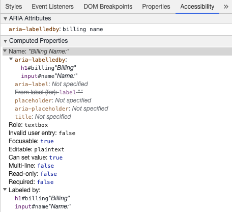
Using aria-labelledby (opens new window) is similar to aria-label except it is used if the label text is visible on screen. It is paired to other elements by their id and you can link multiple ids:
<form
  class="demo"
  action="/dataCollectionLocation"
  method="post"
  autocomplete="on"
>
  <h1 id="billing">Billing</h1>
  <div class="form-item">
    <label for="name">Name:</label>
    <input
      type="text"
      name="name"
      id="name"
      v-model="name"
      aria-labelledby="billing name"
    />
  </div>
  <button type="submit">Submit</button>
</form>
2
3
4
5
6
7
8
9
10
11
12
13
14
15
16
17
18
19
See the Pen Form ARIA labelledby by Vue (@Vue) on CodePen.

# aria-describedby
aria-describedby (opens new window) is used the same way as aria-labelledby except provides a description with additional information that the user might need. This can be used to describe the criteria for any input:
<form
  class="demo"
  action="/dataCollectionLocation"
  method="post"
  autocomplete="on"
>
  <h1 id="billing">Billing</h1>
  <div class="form-item">
    <label for="name">Full Name:</label>
    <input
      type="text"
      name="name"
      id="name"
      v-model="name"
      aria-labelledby="billing name"
      aria-describedby="nameDescription"
    />
    <p id="nameDescription">Please provide first and last name.</p>
  </div>
  <button type="submit">Submit</button>
</form>
2
3
4
5
6
7
8
9
10
11
12
13
14
15
16
17
18
19
20
21
See the Pen Form ARIA describedby by Vue (@Vue) on CodePen.
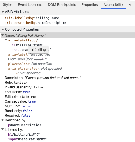
You can see the description by inspecting Chrome DevTools:

# Placeholder
Avoid using placeholders as they can confuse many users.
One of the issues with placeholders is that they don't meet the color contrast criteria (opens new window) by default; fixing the color contrast makes the placeholder look like pre-populated data in the input fields. Looking at the following example, you can see that the Last Name placeholder which meets the color contrast criteria looks like pre-populated data:
See the Pen Form Placeholder by Vue (@Vue) on CodePen.
It is best to provide all the information the user needs to fill out forms outside any inputs.
# Instructions
When adding instructions for your input fields, make sure to link it correctly to the input.
You can provide additional instructions and bind multiple ids inside an aria-labelledby (opens new window). This allows for more flexible design.
<fieldset>
  <legend>Using aria-labelledby</legend>
  <label id="date-label" for="date">Current Date:</label>
  <input
    type="date"
    name="date"
    id="date"
    aria-labelledby="date-label date-instructions"
  />
  <p id="date-instructions">MM/DD/YYYY</p>
</fieldset>
2
3
4
5
6
7
8
9
10
11
Alternatively, you can attach the instructions to the input with aria-describedby (opens new window):
<fieldset>
  <legend>Using aria-describedby</legend>
  <label id="dob" for="dob">Date of Birth:</label>
  <input type="date" name="dob" id="dob" aria-describedby="dob-instructions" />
  <p id="dob-instructions">MM/DD/YYYY</p>
</fieldset>
2
3
4
5
6
See the Pen Form Instructions by Vue (@Vue) on CodePen.
# Hiding Content
Usually it is not recommended to visually hide labels, even if the input has an accessible name. However, if the functionality of the input can be understood with surrounding content, then we can hide the visual label.
Let's look at this search field:
<form role="search">
  <label for="search" class="hidden-visually">Search: </label>
  <input type="text" name="search" id="search" v-model="search" />
  <button type="submit">Search</button>
</form>
2
3
4
5
We can do this because the search button will help visual users identify the purpose of the input field.
We can use CSS to visually hide elements but keep them available for assistive technology:
.hidden-visually {
  position: absolute;
  overflow: hidden;
  white-space: nowrap;
  margin: 0;
  padding: 0;
  height: 1px;
  width: 1px;
  clip: rect(0 0 0 0);
  clip-path: inset(100%);
}
2
3
4
5
6
7
8
9
10
11
See the Pen Form Search by Vue (@Vue) on CodePen.
# aria-hidden="true"
Adding aria-hidden="true" will hide the element from assistive technology but leave it visually available for other users. Do not use it on focusable elements, purely on decorative, duplicated or offscreen content.
<p>This is not hidden from screen readers.</p>
<p aria-hidden="true">This is hidden from screen readers.</p>
2
# Buttons
When using buttons inside a form, you must set the type to prevent submitting the form. You can also use an input to create buttons:
<form action="/dataCollectionLocation" method="post" autocomplete="on">
  <!-- Buttons -->
  <button type="button">Cancel</button>
  <button type="submit">Submit</button>

  <!-- Input buttons -->
  <input type="button" value="Cancel" />
  <input type="submit" value="Submit" />
</form>
2
3
4
5
6
7
8
9
See the Pen Form Buttons by Vue (@Vue) on CodePen.
# Functional Images
You can use this technique to create functional images.
Input fields
- These images will act as a submit type button on forms
<form role="search">
  <label for="search" class="hidden-visually">Search: </label>
  <input type="text" name="search" id="search" v-model="search" />
  <input
    type="image"
    class="btnImg"
    src="https://img.icons8.com/search"
    alt="Search"
  />
</form>
1
2
3
4
5
6
7
8
9
10Icons
<form role="search">
  <label for="searchIcon" class="hidden-visually">Search: </label>
  <input type="text" name="searchIcon" id="searchIcon" v-model="searchIcon" />
  <button type="submit">
    <i class="fas fa-search" aria-hidden="true"></i>
    <span class="hidden-visually">Search</span>
  </button>
</form>
2
3
4
5
6
7
8
See the Pen Functional Images by Vue (@Vue) on CodePen.
